
12 Website Fixes That Increase Enquiries Without Redesigning Everything
A full redesign can be great — but it isn’t always necessary.
Many websites underperform for simple reasons: the message isn’t clear, the next step isn’t obvious, the form feels like effort, or the page doesn’t build trust quickly enough.
This post shares practical fixes you can apply without rebuilding your whole site. Most are small changes that improve clarity and conversion.
If you’d like Empex to review your site and recommend the best improvements, start here:
Web Design & Development
1) Make the first screen answer “What do you do?”
When someone lands on your website, they should understand your offer in a few seconds.
A strong hero section usually includes:
- what you do
- who it’s for (or the outcome you deliver)
- one clear next step (book, call, quote, message)
If your hero is vague, everything below works harder than it should.
2) Use one primary CTA per page
Too many options create hesitation.
Pick one main action per page (for example: “Book a call” or “Request a quote”) and make it consistent across the page.
Secondary links can exist, but the primary CTA should be obvious.
3) Improve your contact form (less effort, more leads)
Long forms reduce completions.
Ask only what you need to take the next step. If you need more information later, ask it after the first response.
A good form feels simple, not like paperwork.
If you want a conversion-focused form setup, we can implement it as part of your site improvements:
Contact us
4) Add proof near the CTA (not only on a testimonials page)
Trust works best when it’s close to the decision.
A small proof block near your CTA can make a big difference. It can be:
- short testimonials
- ratings
- client logos (if appropriate)
- “years in business”
- “projects completed”
This reduces the “risk feeling” right before the user commits.
5) Make pricing or “what happens next” clearer
Many enquiries drop off because people are unsure what happens after they reach out.
Even if you don’t list full pricing, you can explain:
- what the process is
- typical timelines
- what information you need
- what the first call covers
Clarity builds confidence.
6) Improve mobile spacing and readability
Most users are on mobile. If your mobile layout feels tight, hard to read, or “jumping around”, conversion drops.
Focus on:
- readable font sizes
- enough spacing between sections
- buttons that are easy to tap
- forms that are easy to complete
Small layout improvements can feel like a full redesign to a mobile user.
7) Speed matters more than most people think
A slow website doesn’t just harm SEO — it hurts conversion.
Even small speed improvements can reduce drop-offs. Typical wins include:
- compressing images properly
- reducing heavy scripts
- improving hosting and caching
If you need help with performance, we also provide managed hosting and optimisation:
Cloud Hosting
8) Use clearer service pages (not “marketing paragraphs”)
Service pages should not read like brochures.
They should answer real questions:
- who is this for?
- what problems does it solve?
- how does it work?
- what does the customer get?
- how do we start?
Clear pages rank better and convert better.
9) Remove distractions that fight your CTA
Common distractions include:
- too many popups
- busy animations
- unnecessary sliders
- multiple competing buttons
The goal is not to impress visitors — it’s to guide them.
10) Add a simple “Why choose us” section
People want a reason to trust you.
A short section that explains your strengths (in plain language) can be enough:
- quality and reliability
- clear communication
- experience and results
- fast response times
- local availability (if relevant)
Avoid empty claims — make it specific.
11) Make the navigation easier
If users can’t find what they need quickly, they leave.
Navigation should make the main paths obvious:
- services
- proof (testimonials/results)
- contact/booking
- about (trust)
Your blog can help with traffic, but the site must convert that traffic into action.
12) Add one strong “conversion page”
Most businesses need one page designed primarily for conversion.
That can be:
- a booking page
- a quote request page
- a lead magnet page
- a “start here” page
This is where you focus your best copy, proof, and CTA.
For example, you can route visitors to a quote flow or booking flow like this:
Book a call
A simple way to prioritise fixes
If you want a quick approach, start with:
- clarity of offer (hero section)
- CTA + form improvements
- proof near the CTA
- speed and mobile layout
These tend to produce the biggest improvements fastest.
Want Empex to review and improve your website?
If your website is getting traffic but not enough enquiries, you don’t need guesses — you need a clear improvement plan.
✅ Book a website / conversion audit: Book now
Or ask a question: Contact us
Comments
No comments yet. Be the first to leave one.
Related posts
View all →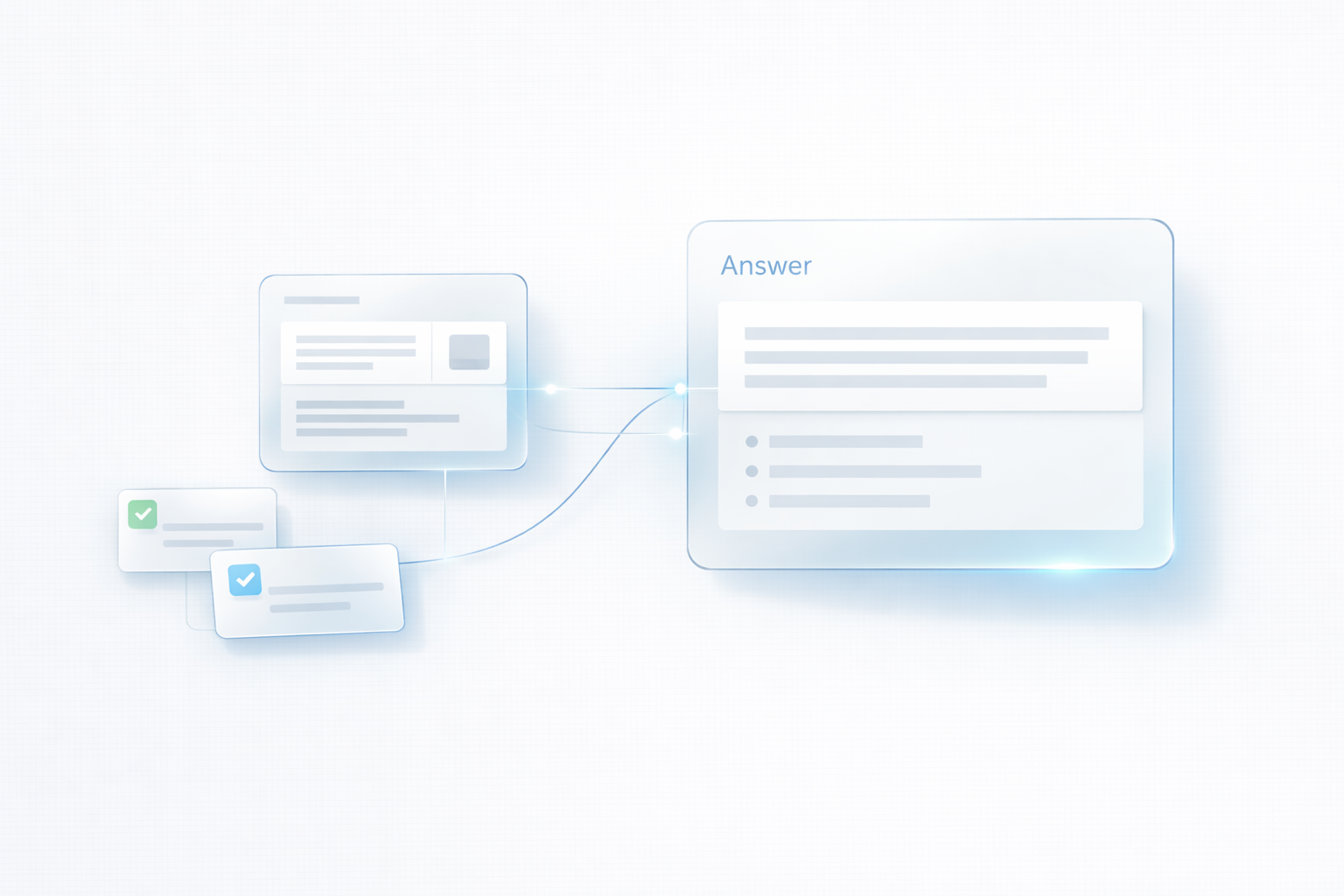
How to Write Content That AI Search Can Cite (A Simple Framework)
A simple writing framework that helps your content become easier for AI search tools to reuse and cite. Learn how to structure pages with clear definitions, decision factors, examples, and next steps.

The 5 Automations Every UK SME Should Implement First
Five practical automations that help UK SMEs reduce admin, respond faster to enquiries, and convert more leads — without adding complexity or losing the human touch.

AI as Infrastructure: A Simple 30-Day Plan for UK SMEs (With Real Examples)
Most businesses don’t need “more AI tools” — they need reliable systems that remove admin and convert leads faster. This simple 30-day plan shows how UK SMEs can implement AI automation step by step.